
Boneshaker Adventures is a mountain biking skills camp and adventure tour group based in Grand Junction, Colorado. Boneshaker focuses on teaching kids skills to navigate mountain bike trails safely.
This design project is more of a design update than a total redesign. Boneshaker already had the essential idea for their logo sketched up and asked us to update the overall look. For the update we focused on three things: redrawing the skull while still using the essential elements, updating the typeface, and adding color.
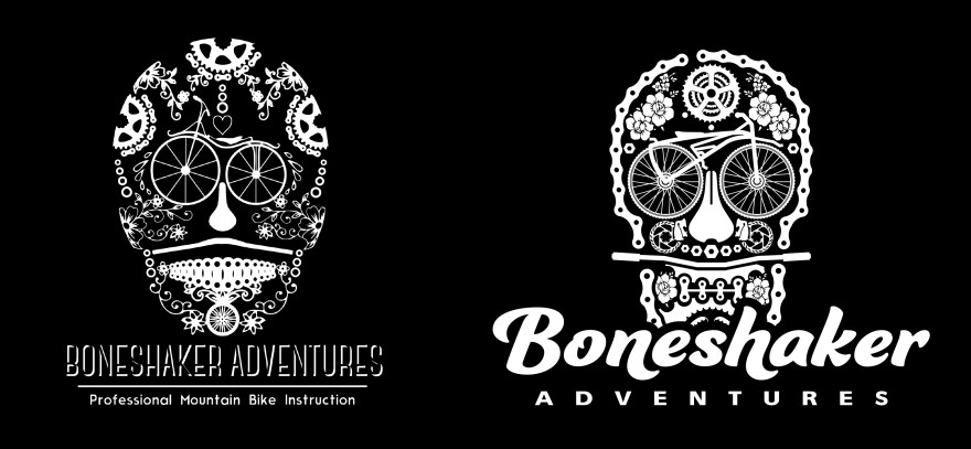
Starting with the skull element, our goal was to simplify the art and make it more legible at multiple sizes. We kept the main bone shaker bike as the eyes but redrew it slightly to add symmetry to the art. We also resized elements like the bike seat nose and chain link teeth for simplicity. The over all shape of the skull was also reimagined to give it a more classic and easily identifiable look.
As you can see from the original Boneshaker design, a majority of our effort was spent working on a new typeface that captured Boneshaker’s youthful spirit and was more legible at distance. The only instruction was to create something bold and something that wasn’t overtly masculine. The new Boneshaker typeface is bold, shows movement, and can work as a stand-alone element.
The overall design update is impactful in one tone but we also wanted to add color. The orange and gold color scheme is inspired by the natural sandstone features and sunsets that dominate high desert landscape. Adding spots of teal, purple, and white add a vibrancy to the logo and again, match the playful nature of Boneshaker Adventures.

