Maria aka “The Hot Tortilla” is a local guide, content creator, and placemaker from Santa Ana, California. She asked me to build out a new design to help her promote her brand. Maria’s aesthetic is rooted in both her Mexican upbringing and American Traditional tattoo designs.
This drawing was hand drawn, then finished off in Illustrator. It was a fun project to work on! She’s already turned it into stickers and enamel pins. I can’t wait to see what she does with it next!
This is just a beautiful poster I created for our story time programs. I was inspired by the whimsy and joy of children’s books and wanted to create something imaginative.
For every completed logo or design, there are countless unfinished or rejected projects that never see the light of day. This is one such project.
This Mars Rover illustration is a detail from what was going to be a larger mural installation in a middle school science lab. The initial rover drawing was painstakingly recreated from original NASA concept art. I wanted to get the details right, and also practice my precision drawing.
The boom box was added as one of many fun elements. The project was scrapped before the whole mural was completed. Other planned elements included a sunbathing astronaut and giant tentacled space monster.
Although unfinished, I’m still really excited about this rover drawing. It’s presented here just as a cool sample of unfinished work from the archives.
Above is the initial line drawing completed using the NASA concept art as reference. This process was painstakingly slow and turned out to be a lesson in patience.
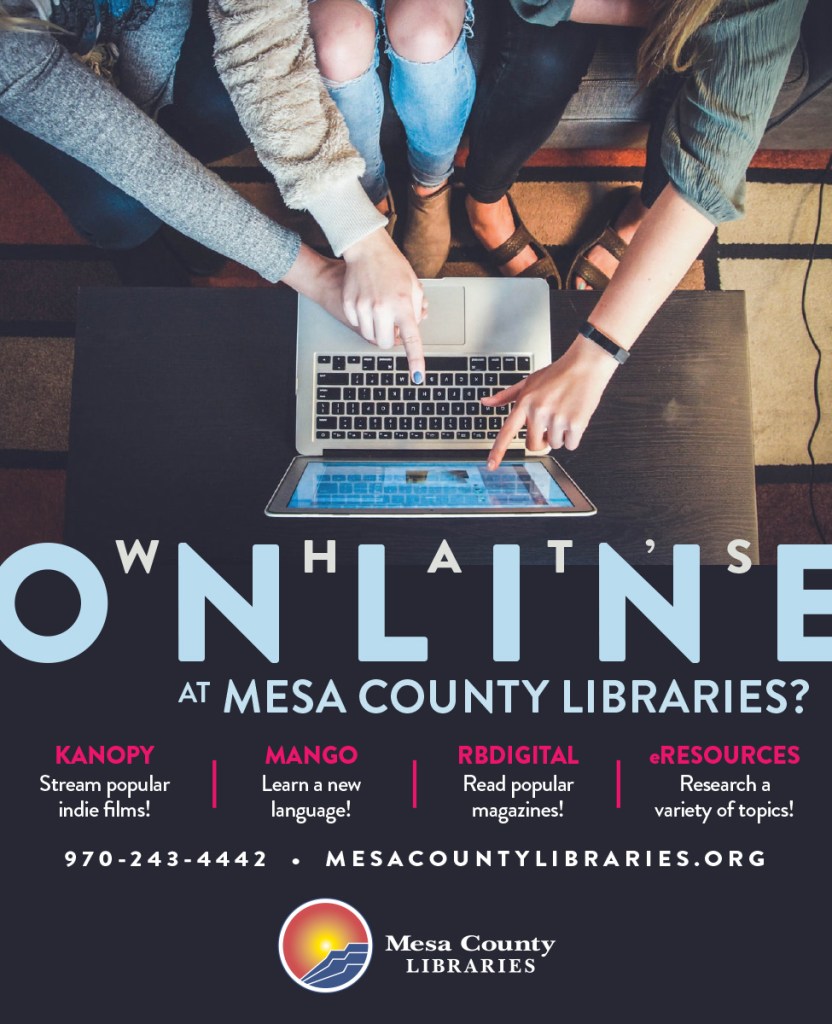
New ad for Colorado Mesa University’s Horizon Magazine features some of the online resources available online at mesacountylibraries.org. The ad is simple and highlights just a few of the many resources available online that college students might find useful.
One of my goals when designing for libraries is to simplify the ad copy as much as possible. Libraries have so many great services to offer, but it can be a challenge to promote those services without overwhelming the public with information.
In these two ad examples, I focused on library benefits (targeted to specific users) and simplified as much as possible. The “What’s Online” ad is targeted to college students. Instead of listing all available library resources, I wanted to promote library online resources that can be used for school work (Mango Languages and eResources) and for entertainment (Kanopy and RBDigital).
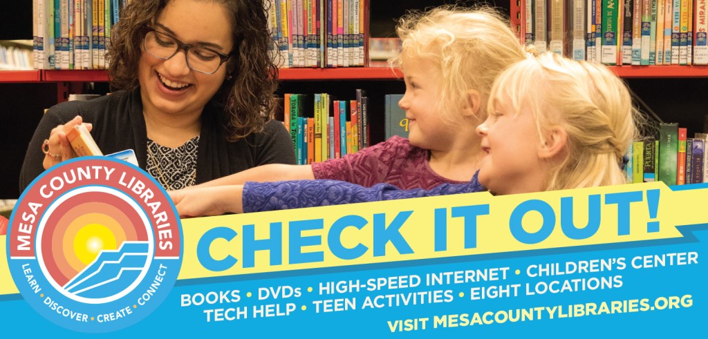
The “Check It Out” ad is targeted towards parents. This ad features family services like the children’s center and teen activities, and the convenience of having eight locations across the county. The call to action for both ads is simple, visit us online at mesacountylibraries.org.
The ad appeared on grocery shopping carts across Mesa County. Targeted toward parents, this ad promotes family services.
You’ll also notice that both ads highlight the social benefits and collaborative nature of the library. The “What’s Online” shows how the library can connect people anywhere, like a dorm room, via the website. The “Check It Out” ad shows how much fun families can have when discovering the joy of reading.
This social theme is something I try to work in as much as possible as it is an important function of 20th century libraries.
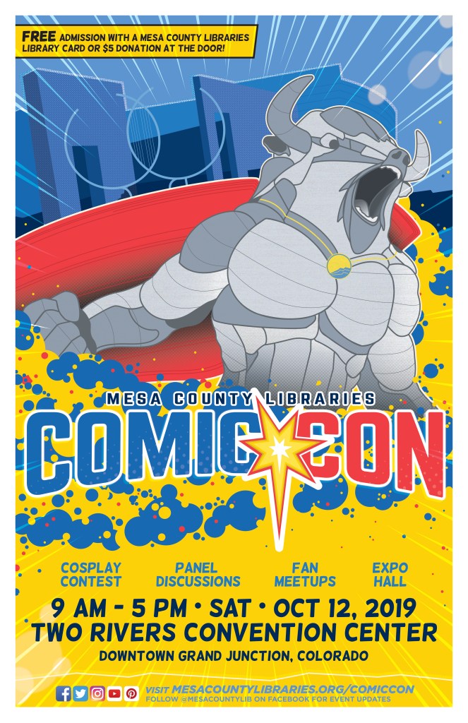
The main artwork for Comic Con 2019 was inspired by the “Chrome on the Range” statue in Downtown Grand Junction.
Mesa County Libraries Comic Con 2019 is wrapped up and in the books! It was another great year and we saw the event grow in both attendance and quality. This year I expanded my role with the event. I created the marketing strategy and design work for the event, ran the official merchandise booth, and hosted a panel presentation / podcast.
The main artwork for this year’s event was a blast to work on! I took inspiration from an iconic statue downtown and turned it into a super hero. The goal was to create a dynamic poster that ties the event to the new creative district in Downtown Grand Junction. Between the bison and the Two Rivers Convention Center silhouette in the background, I think I accomplished that goal.
To help make the connection between the Comic Con poster artwork and the “Chrome on the Range” statue, me and another artist Emmi Farris, installed a red cape on bison for Downtown Art Fest.
The other major design element of this poster was the “Kirby Crackle.” I wanted to pay tribute to one of the greatest comic creators and artists ever, Jack Kirby, by using these circle patterns in this illustration.
PMA Wellness is a new effort encouraging mental health in the straight edge community. Inspired by Toby Morse from H20 and John Joseph from the Cromags, this project is another welcome addition to the Colorado mental health landscape.
Show poster for Denver band American Culture, featuring Bronco Country, Natural Violence, and Wrestle Mania.
Copeka Coffee is a coffee shop and performance venue focused on serving delicious coffee, organic pastries, and killer concerts. Copeka is also committed to being as inclusive as possible and building community.
As a designer, musician, and an occasional coffee drinker, I totally support their mission. I also love making posters and encouraging people to check out their events. Here are a couple recent designs.
Show poster for a collection of local artists and musicians.
In July 2019, the Fruita Zine Party put out a special edition for the DIY Noise Collection, a concert and art series featuring several bands and artists. Here are a selection of pages I designed for the issue.
Zines are fun projects to work on. As you can see from the images, pages can be about any subject matter, and the publisher encourages artists to be as creative as possible. These pages were inspired by a bright color palette, and the endlessly hot days of summer.
This screen print was inspired by the cult 90s film “Encino Man.” Always wheeze the juice.Tribute to Jon Contino, a great designer known for his hand drawn work.
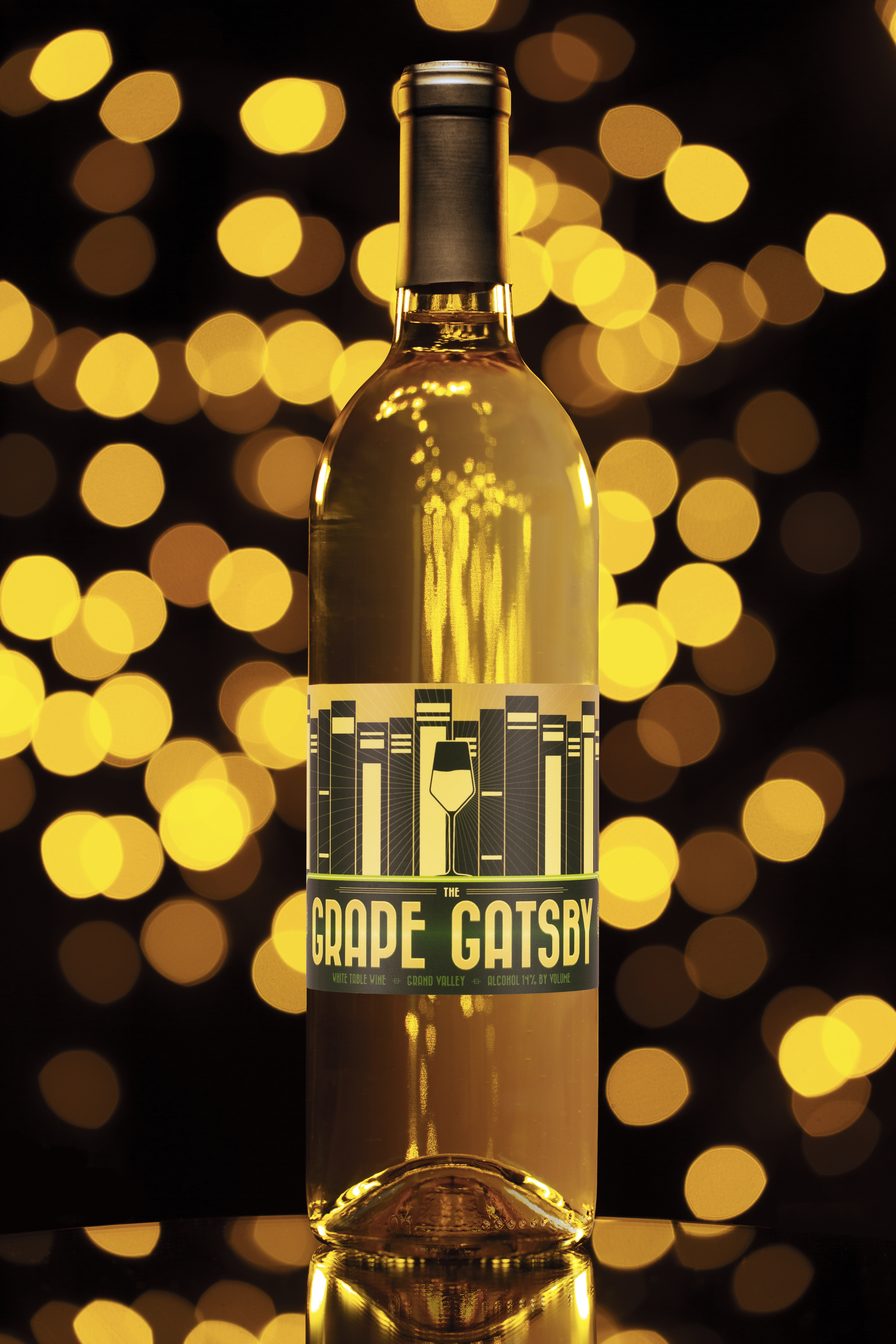
“The Grape Gatsby” is the latest wine from the Mesa County Libraries Foundation.
Mesa County Libraries Foundation has once again partnered with Grande River Vineyards in Palisade, Colorado to create a private label wine.
The Grape Gatsby is the second specially branded wine to bear the Foundation’s name. Well Read, a red table wine, was launched last year. Both wines are produced and bottled by Grande River Vineyards, and both are available for tasting and purchase.
“The Grape Gatsby” is a white table wine inspired by the F. Scott Fitzgerald classic “The Great Gatsby.” The label uses the same general layout as Well Read to help reinforce the brand. The design is made in an art deco style with plenty of gold to help bring out the tones in the wine.
My favorite elements are the art deco wine glyphs I made for the side panels. I’m also not a huge fan of gradients but here they help give the label a subtle glow and add some depth to the design.
Mesa County Libraries Foundation “Well Read” and “The Grape Gatsby” wines. Wine bottle photos by Sean Edens.
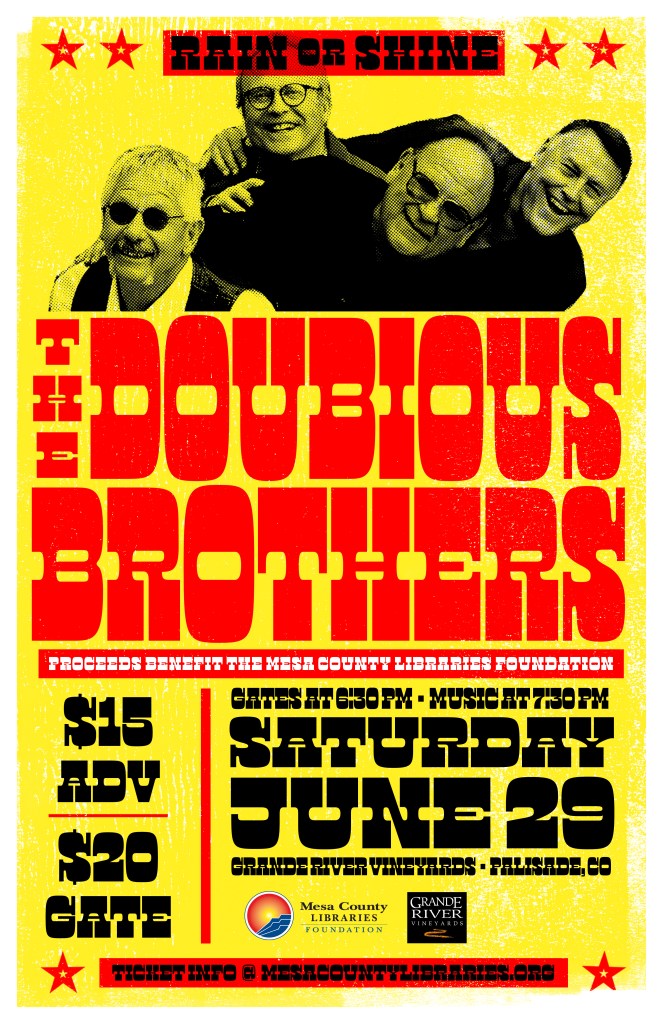
Along with designing the wine labels, I also helped organize a launch event featuring The Doubious Brothers band. Here is the show poster. It’s inspired by a recent visit to the Hatch Show Print, a letterpress print and design shop located in Nashville, TN.
Show poster to promote “The Grape Gatsby” wine launch.
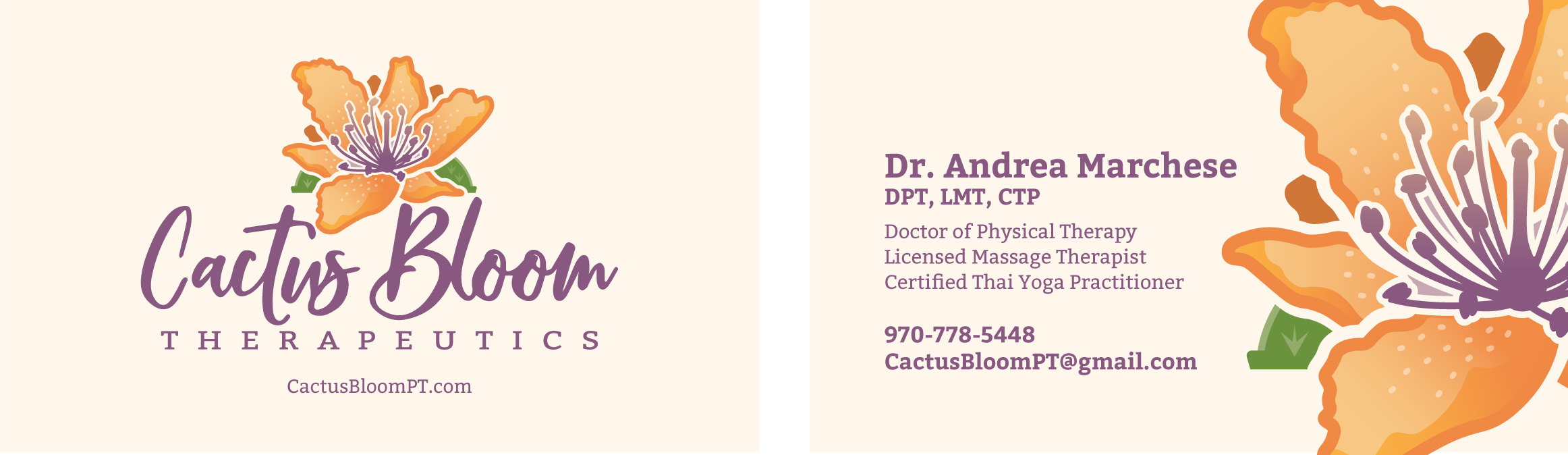
Cactus Bloom Therapeutics is a physical therapy business run by Dr. Andrea Marchese. Cactus Bloom combines a number of disciplines, including massage and Thai yoga, to treat her patients.
Cactus Bloom’s logo redesign was a simple process. Dr. Marchese wanted a logo inspired by a cactus flower growing in her yard. She also wanted it in a color scheme that invoked the desert landscape.
Dr. Marchese provided a number of photos of the flower, and a painting that helped develop the color palette. The end result is a simplified, colorful version that Cactus Bloom can be proud of.