Historical Sign Update

Recently, I got to work on a historical sign update in Collbran, Colorado. On February 1, Mesa County Libraries installed new window signage at the Collbran Branch Library. Paying homage to the history of Collbran, the new signage is a unique addition to the library.

Thanks to a Historical Society Grant in 1995, the Collbran Branch was relocated to the Stockmen Bank Building on Main Street, Collbran. The original Stockmen Bank opened for business in 1916 and the building was remodeled to its current form in 1929.

The Collbran Branch maintains much of the original charm of the 1929 remodel including the original bank safe dated to 1908, interior wood molding accents, iron work surround the exterior windows and door, and decorative brickwork on the front facade, including “Stockmen’s Bank” in blue and white terracotta frieze.

While the building itself is a beautiful example of early twentieth century western architecture, it has proved challenging to rebrand it as a Mesa County Libraries location. The building was added to the Colorado State Register of Historic Properties in March 8, 1995, so major modifications were out of the question.

Working with the Town of Collbran (Stockmen Bank building owners), we were able to get approval to add a window signage to building to help identify the building as a library, and prominently display library hours.  

In an effort to match the charm and historical nature of the building, we threw out our style book and focused on designing signage that would have been historically accurate to 1929. Specifically, we sought to replicate the hand-painted, gold leaf signs often found on bank, salon, and barbershop windows from that era.

Using historical photos of Plateau Valley and other western towns for reference, the design focuses on the word “Library.” Large, gold block serif letters scroll across the top of the design, and are framed by hand-drawn ornaments. Mesa County Libraries colorful sunrise logo was redesigned as a two color, gold and black logo to help unify the sign to the existing building elements.   

Working with a sign vendor we were able to find on a vinyl material that replicates a gold leaf texture, while still being affordable and durable enough to hold up to the weather elements. The overall look is pretty stunning, and adds new sparkle to the Stockmen Bank.    

Library-Sign-2

Concert Posters

Designers are always looking for total creative freedom. When approaching a project, nothing is more appealing than the phrase “do whatever you want.” While that attitude doesn’t work out so well for commissioned projects, it always plays when making concert posters.

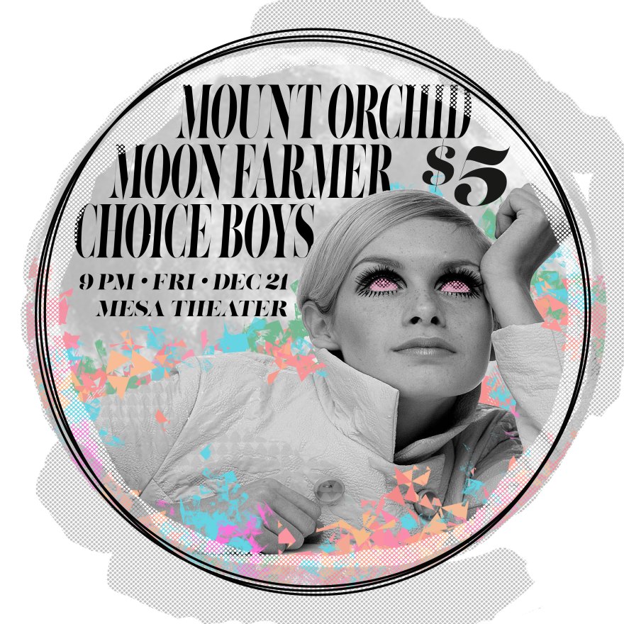
Concert posters are a blast to make, and since I play in a band (Mount Orchid) and hang out with a lot of musicians, I get the chance to make a lot of them. My general approach is to be as wild as possible, no limitations.

Wild color schemes, fun font treatments, and weird art make for an eye catching combo. I’m a fan of taking art out of context and reusing it in creative ways. This three-armed gorilla for example, was a piece of art I found on a vintage Czech circus poster. With some color adjustments, hand-drawn fonts, and an expressive brush palette, it’s now a fun advertisement for a concert.

tight-orchid

moon-poster

The stakes are pretty low when designing concert posters. They are temporary ads that are not meant to last forever, like a commissioned logo. I think that’s why I like making them so much. It’s total freedom and the chance to be creative just for the sake of being creative.

Longo, Bacon

“I believe in deeply ordered chaos.” – Francis Bacon, painter

“Longo, Bacon” is an art piece I made for recent art show celebrating artists Francis Bacon and Robert Longo. Both artists made work about identity, isolation, and anxiety, themes I often feel and think about.

This collage takes the iconic character poses from Longo’s “Man in Cities” project, and places them in the expressive and chaotic world of Bacon. All the expressive brush work and boxes hint at themes of isolation and anxiousness. Creating this piece, I imagined myself as the central image trying to make sense of the world around me. I like the juxtaposition of a dirty maddening background against the clean but anguished characters of Longo. It suggests that even when you think you’ve got the world figured out, chaos is all around you.

Generally, this style of art work falls outside of my comfort zone. However, as a creative it is important to push your self to try new styles. As Longo said, “an artist should know art history.”

The final piece is a 24 x 32 inch, mixed media collage.

Zine Party

I was recently asked to contribute some artwork and writing to a pop-up magazine. These projects are fun to work on as it is a chance to create something completely from your own imagination without having to answer to a client.

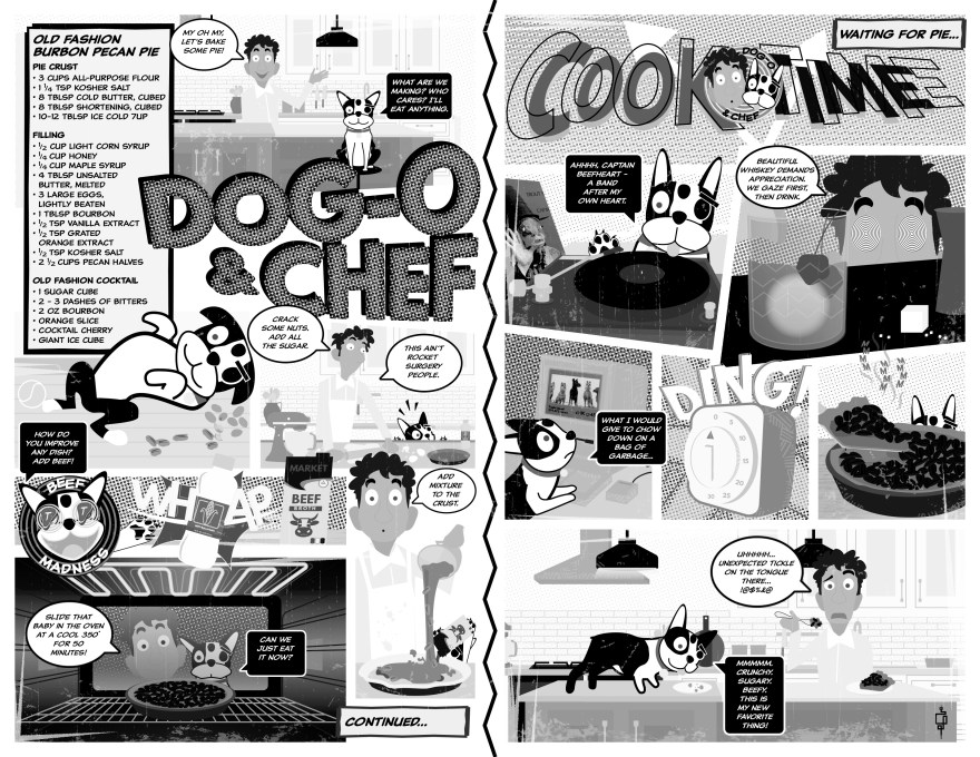
For this pop-up I created four items: “Shed Your Skin – Wild Ghost logo,” “Electric Ballroom” short story, John Contino tribute skull, and “Dog-o and Chef,” an original comic short.

Shed Your Skin – Wild Ghost logo

This is a new take on my own Wild Ghost logo. I’ve had the idea to make a glyph using the Wild Ghost snake in the shape of a “G” for a while and this iteration feels really good. Eventually as I develop my brand I see this as being a stand alone mark.

The “Shed Your Skin” text is really a reminder to myself that when I fell boxed in to a certain artistic style that I have the freedom to change as needed. This really is the essence of Wild Ghost and why I founded the company. I wanted to create something that was unshackled and free to inhabit any artistic form I need the company to take, hence, Wild Ghost.

goe-zine-layout-1

“Electric Ballroom” – Short Story / John Contino Tribute Skull 

The “Electric Ballroom” short story in an excerpt from a longer unpublished fictional piece I wrote about a local band struggling for attention in a small town. I chose this section because I really like description of the main character playing guitar. I’m obsessed with Fender instruments and their offset guitars always seemed so cool to me.

John Contino is one of my favorite designers and I love how expressive he can be using a combination of digital and hand drawn art. I struggle sometimes with digital art, particularly getting a computer to be as expressive as I want it to be. I’ve been studying Contino’s technique in the hopes of learning how to bring a more personal feel to digital design. This skull was hand drawn, based off one of his drawings, scanned into Photoshop, and redrawn from there. The lines in the finished skull seem more lively to me. It’s a little extra work to get this effect, but I’m looking forward to using this technique in upcoming projects.

comic-cook-book

Dog-o and Chef – Comic Short

This was by far my favorite piece to create for the magazine. I’m my spare time I really love cooking and every time I’m in the kitchen my Boston Terrier is at my feet, hoping to catch a couple scraps. This is a real pecan pie recipe, but as you can see, when you let a dog be your sous-chef, things can take a turn for the worse!

While fun, this project turned out to be much more time intensive than I anticipated. Character drawing in particular was difficult. Drawing my dog in multiple positions, while still maintaining his defining characteristics was a challenge.

boston-poses

Vibrant Together Logo

Vibrant Together is an update to Downtown Grand Junction’s 2019 plan of development. The goal of the project is to outline a strategic plan for the multiple areas of Downtown Grand Junction including the River District, Rail District, and the Central Business District.

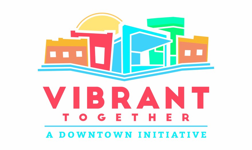
Vibrant-TogetherDowntown Grand Junction wanted a logo for the project that represented more than just Main Street. For the design I choose to color block abstract representations of the various districts included in the plan. The orange buildings represent the brick buildings on Main Street, the red building represents the warehouses in the Rail District, the blue building is the Los Colonias Amphitheater in the River District, and the green building represents the Business District.

The bold color choices are meant to reflect the creativity and vibrant energy of Downtown Grand Junction. As the project develops, the goal is to use the colors to represent the individual downtown districts.

Downtown-District-Map

New growth is already taking place in the River and Rail Districts so it was important to highlight those areas as much as possible in the design. The new Los Colonias Amphitheater sits at the center of the design, just above two bold blue lines meant to invoke the prominence of the Colorado River. Anchored on each side of the logo are the brick buildings of Main Street. This adds balance to the design and is meant to unify the districts and show that the strategic plan is focused on the entire area, and not just the Central Business District.

Vibrant-Rack-cards


Dia de los Muertos

Bold colors, big ideas, these are the types of projects I love working on. This year for Día del los Muertos I got the chance to create some artwork for a Spanish celebration. The first image is a alebrije, which is a fantastical creature from Mexican folklore.

My take on the alebriije is a cat with antlers and raptor claws. Not really sure where this idea came from but the client gave me free reign to create something unique and wild, and this was the result!

Dia-de-los-Ninos-Alebrije-2018-2

The brightly colored creatures in the excellent Pixar movie Coco are all alebrijes. I used the movie for color and pattern reference and based this drawing off the general shape of an ocelot. I also textured the alebrije with a watercolor paper pattern to give it a textile feel.

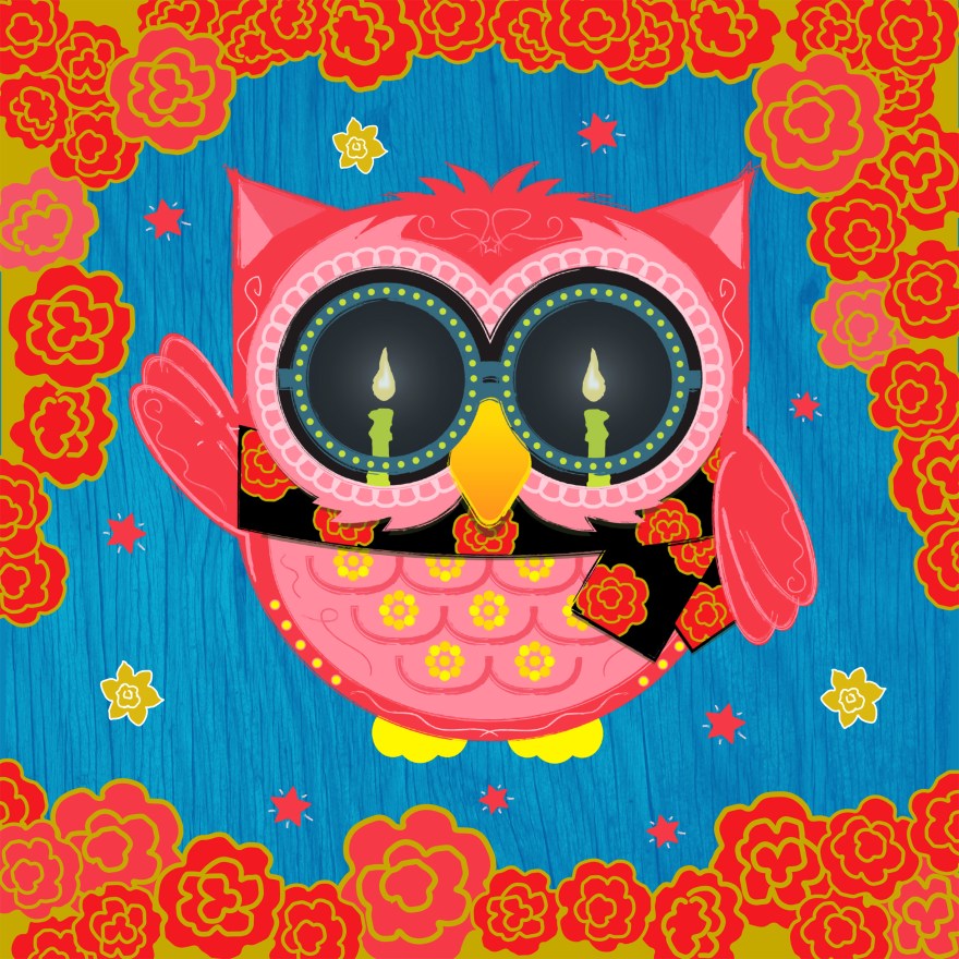
The second image is an owl done in the Día del los Muertos style. Here the image is framed with marigolds, the flower traditionally placed on alters during Día del los Muertos.

Spanish-Story-Time-Square-2016